Post discusses various types of normality tests and their functions in R.

Primarily visualizing data from census bureau of India and other cool stuff using R
Post discusses various types of normality tests and their functions in R.
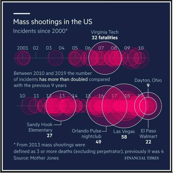
How many deaths occured in USA from Gun Violence since 2001.
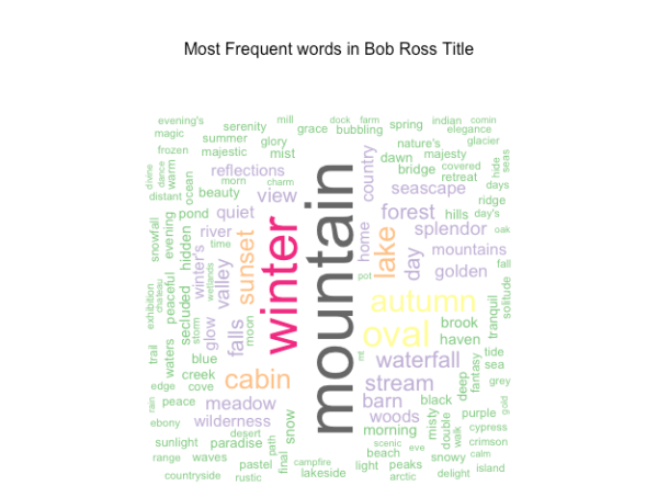
Learn to create wordcloud in R using the Bob Ross data provided as a part of Tidy Tuesday week 32.

Article provides a concise discussion of the most recent India Economic Survey.
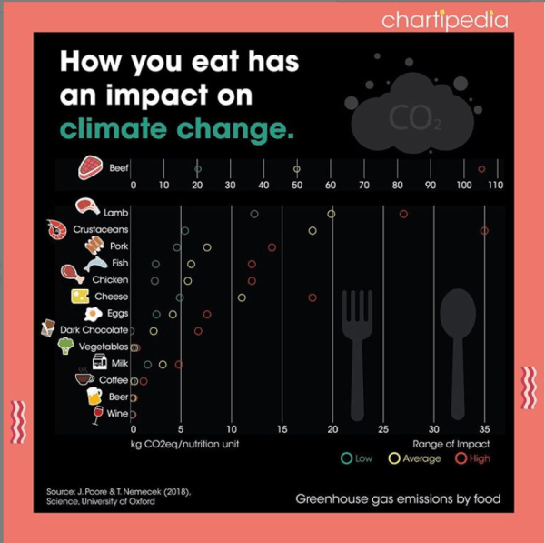
Environmental impact of consumption of different foods.
The trend in power plants installed capacity in India using an animated line chart in R using ggplot2 package.

This posts discusses the limitations of the chart from Ministry of Power website and how it could be improved.
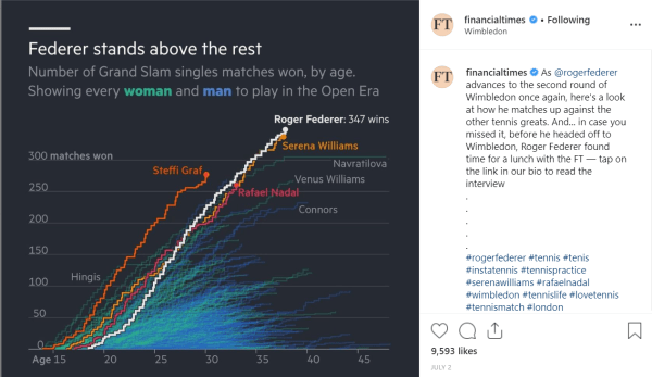
A simple step plot showing the number of Grand Slam singles matches won by age.

The post shows the search of the word "Super Over" in google trend.
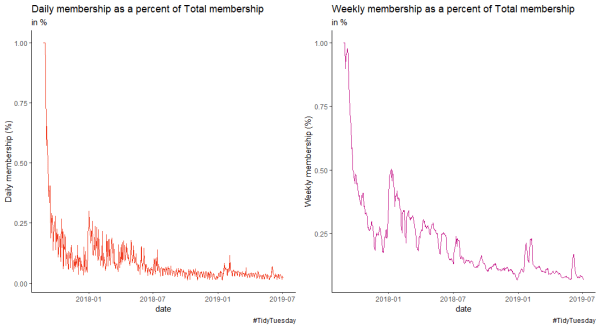
Using R4DS membership data to create line plots in R.

A collection of Tidy Tuesday submissions made on twitter for wommen's soccer world cup 2019 made in R.

This post contains all the visualizations generated in R using the #tidytuesday data set on UFO sightings.

Lear to create map in R using the ggplot2 package
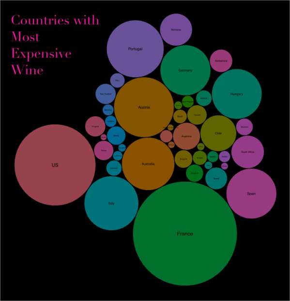
learn to visualize Wine data in R using packed circle visualization method
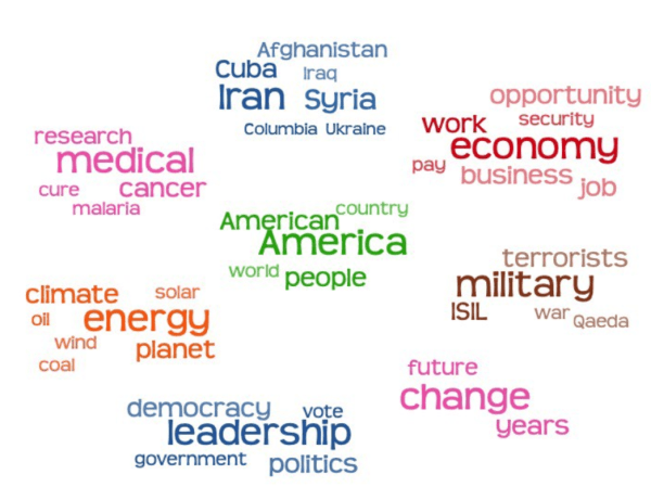
Article discusses the limitation of traditional word cloud visualization and how word cloud can be improved.

Article provides information such as code and Instgarma page links to art generated using Python.
A blog post by Roger Peng explaining his views on design thinking.
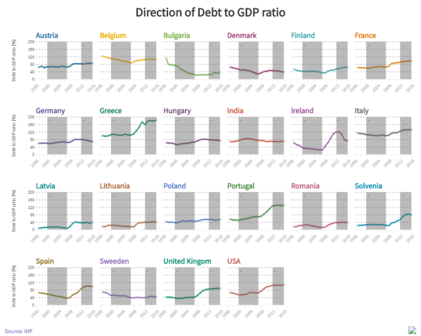
The article discusses the rising debt levels in european economies using animated bar plot and multiple line charts. The visuals are generated using flourish
article lists free online resources to learn ggplot2 package and data visualization techniques.
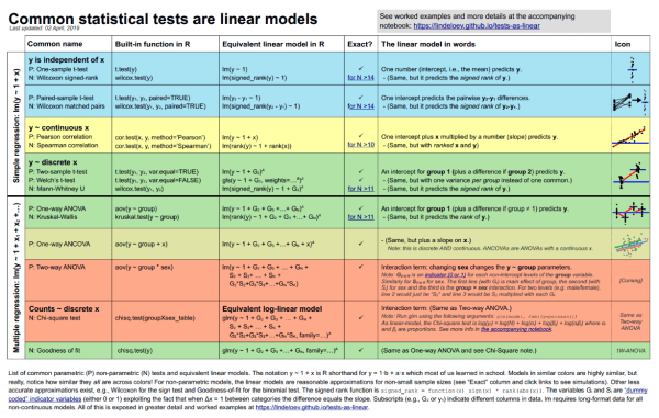
Articles provides R code and details on various statistical tests for linear models. A good summary for teaching linear models.
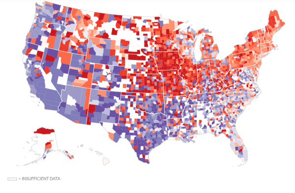
Visualization showing the pizza capital of the USA.

The animated visualization shows the rise in population for Indian states from 2001 to 2026. Learn to create a bar race chart using flourish.
Articles explains methods to detect outliers and strategies for working with new data.
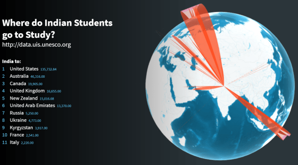
Interactive visual showing countries most preferred by Indian Students in 2016 . Learn to create this using a web based tool called Flourish
A great video that explains wealth in USA and wealth tax using great visual story telling technique.
Learn to visualize Hierarchy or grouped data in flourish using the data related to languages in India
Articles shows how important it is for the Government of India to publish reliable and accurate data.
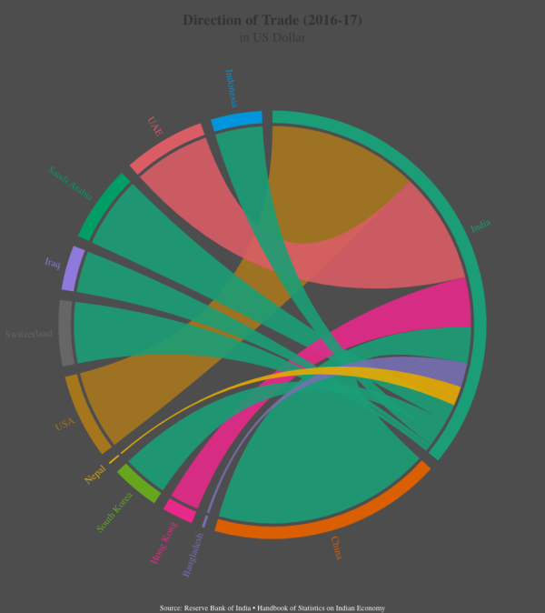
Learn to create interactive chord diagrams in flourish using trade data from India
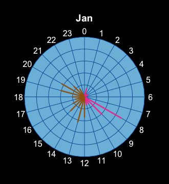
Learn to create a Radial plot in R using the Iphone health data from your Iphone.
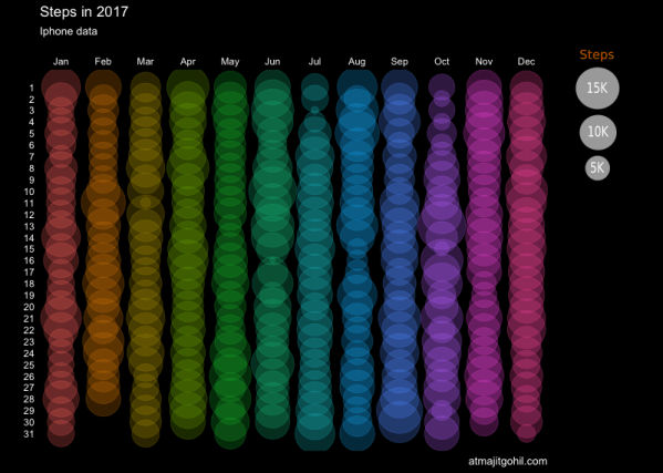
The circular plot is generated using gggplot2 and Iphone health data showing the number of steps walked during 2017.
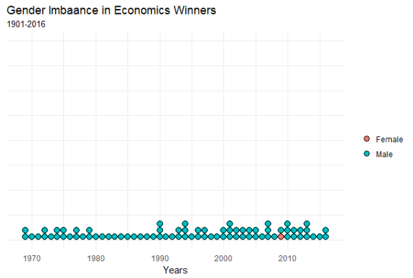
Post shows the gender bias in among Nobel Prize winners in the field of economics using the dot plot in R.
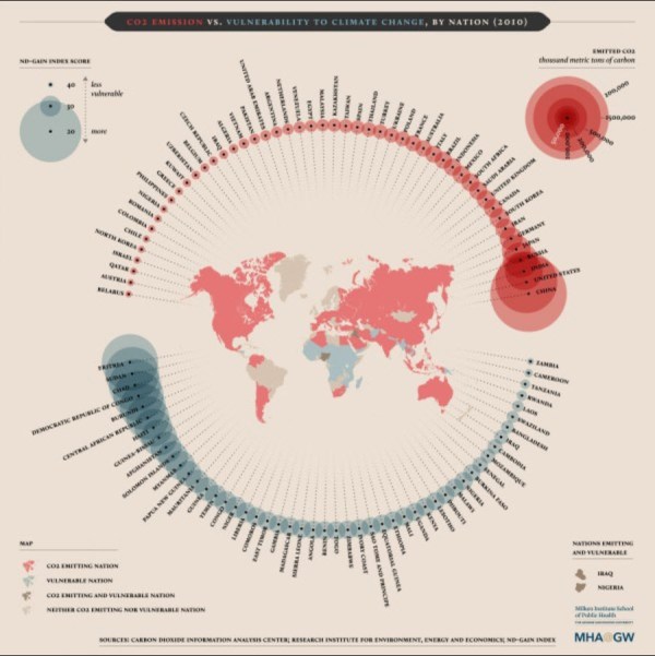
This visualization compares nations with most CO2 emissions and nations most vulnerable to climate change.

A circular plot showing the trading partners of America.

The post analyzes the trend and volatility observed in digital currency market using the crypto package in R.
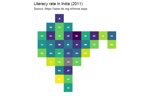
This post discusses two interesting post on tile grid maps and how they can be used to visualize data from India.
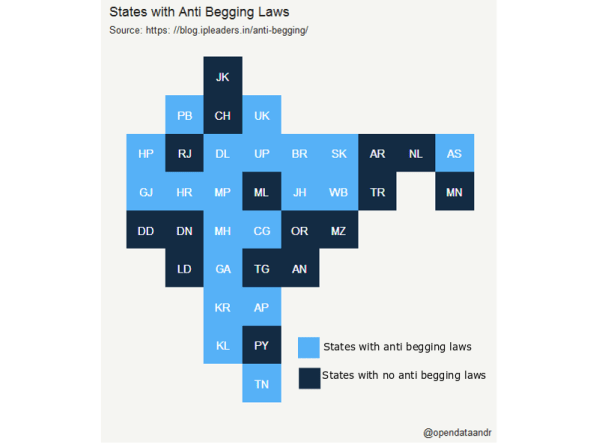
The Tile map of India shows states which have laws that penalizes begging.
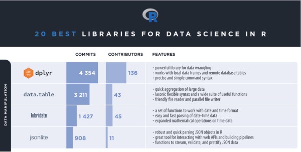
Post provides a list of top 20 R libraries in 2018 for data science.

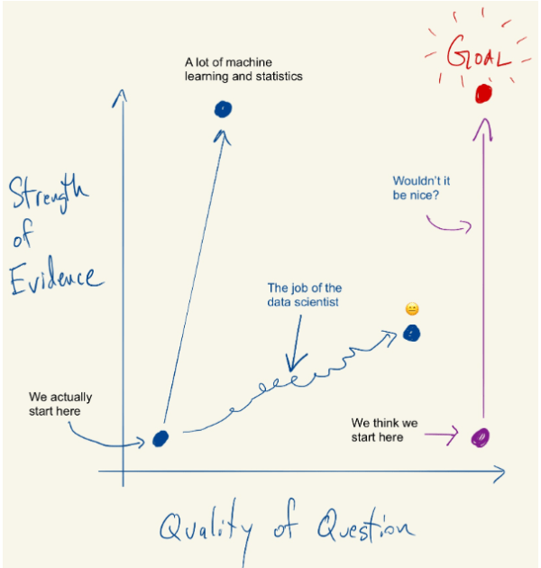
This post provides a quick summary of economists view of the difference between machine learning and econometrics.
The population of India is projected to reach 1.39 billion by 2026. The important issue facing India is how to sustain this?
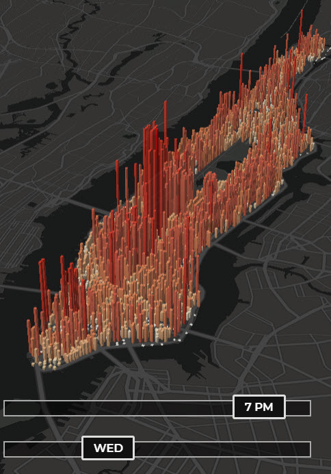
Visualization shows hour by hour change in the population of Manhattan.

The article provides an explanation on methodology to calculate comprehensive concentration index and entropy index using a user defined function in R.

NBER digest highlights the factors contributing to the stagnant wages in USA using HHI measure.
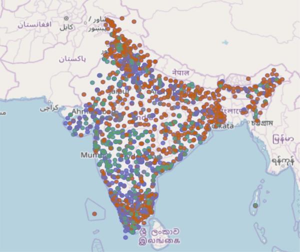
Locate the closest blood bank to you in India.
Understanding concentration measures such as Herfindahl-Hirschman Index (HHI) to analyze markets and horizontal mergers.
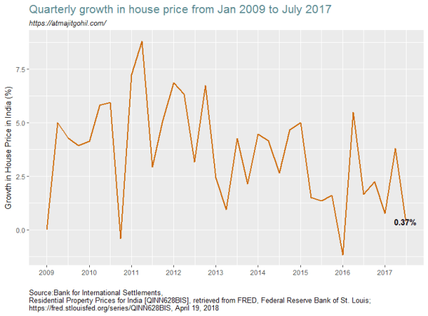
Understanding the trend in home prices in India from 2009 to 2017.

part II of Learn how to make a tile map of India.
Learn to create a tile / grid map of India.

I visit various websites to collect data. Most of the sites i visit are mostly managed by various Government of India central or state departments / ministries. Given everything is digitized one realizes the extent to which this digitization has brought to light some of the issues related to quality of the websites as well... Continue Reading →

visualizing statewise murder cases in India from 2010 to 2016 using Geo Facet plot in R.
The National Crime Records Bureau (NCRB) in its yearly publication titled Accidental Deaths and Suicides in India reports 11 main causes of death in India from road accidents. The total deaths in India from road accidents is 148707. The top 4 causes of road accidents are dangerous/careless/ overtaking, speeding, other causes and weather. These 4... Continue Reading →
